Words that keep players safe.
At LeoVegas, a lot of the daily work revolves around making small updates and adjustments to existing flows – less creating copy from scratch, and more fine-tuning copy based on each market's needs.
I'm the sole UX Writer at LeoVegas, and part of the Product Design team. Working with around 20 designers makes it hard to be involved in every project end-to-end, so I'm typically deeply involved in a few big initiatives and gather information and write copy for the rest.
LeoVegas is a multinational company with 9 brands across 10 markets – the biggest being LeoVegas and BetMGM. i-Gaming is complex, and regulations differ in every market.
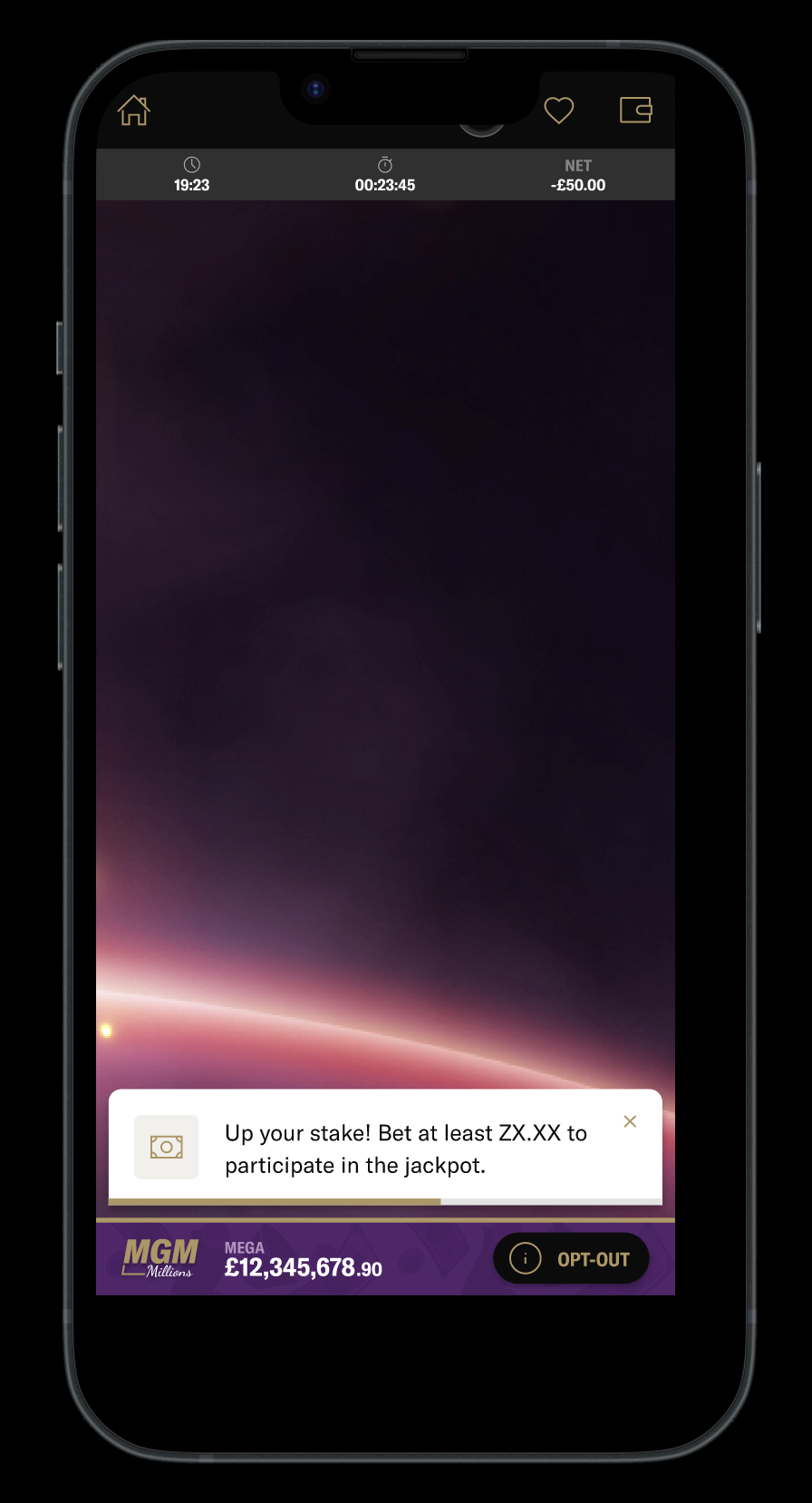
Responsible gambling
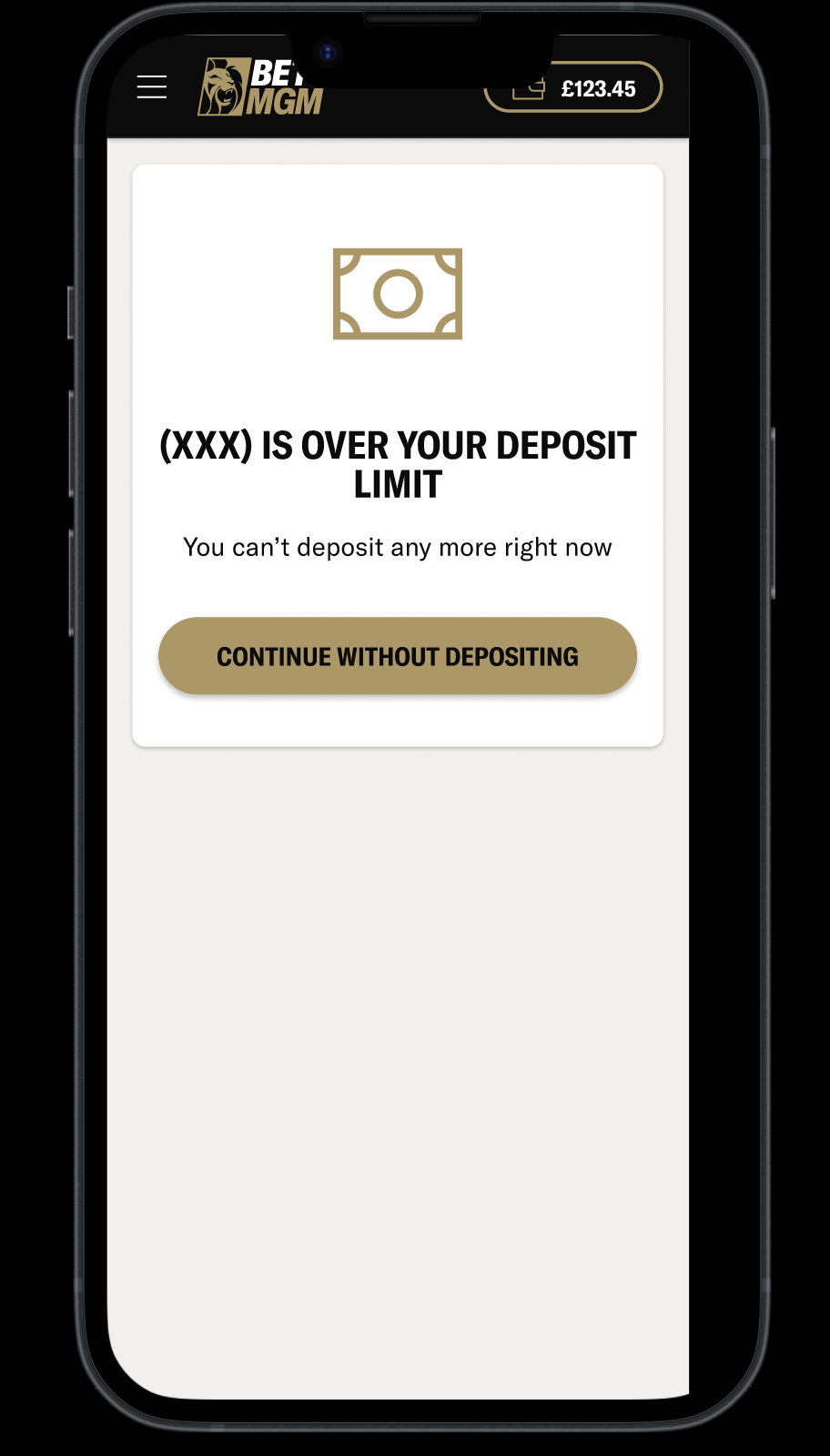
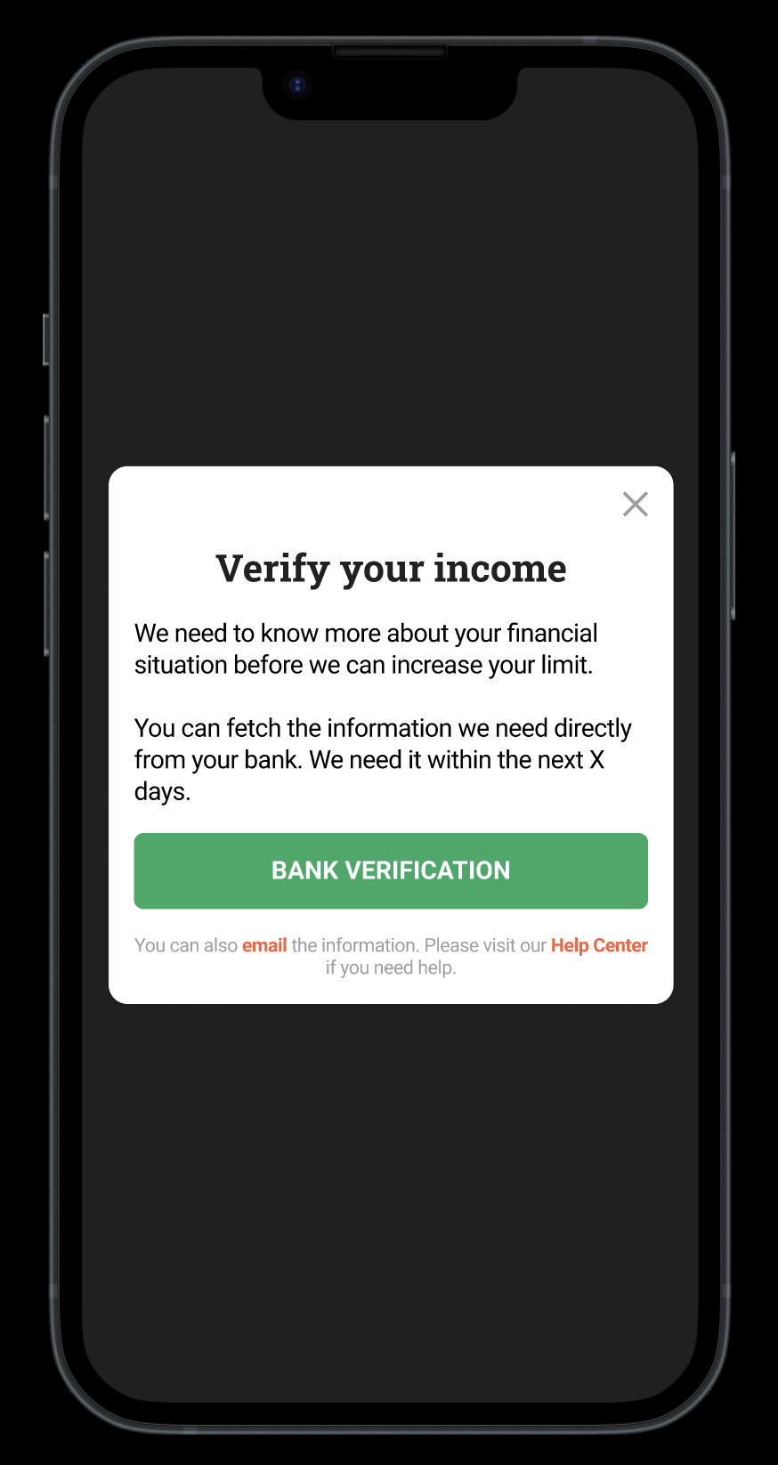
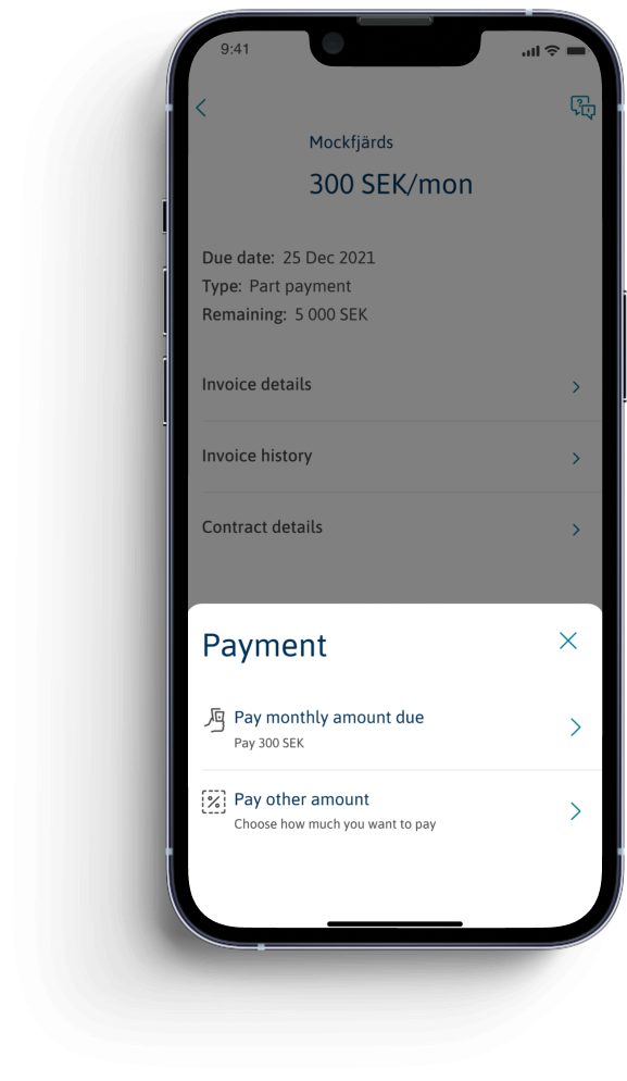
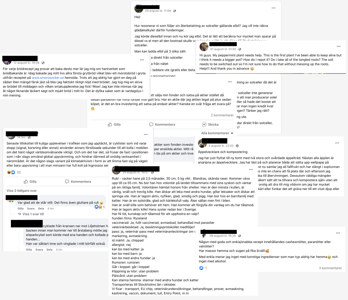
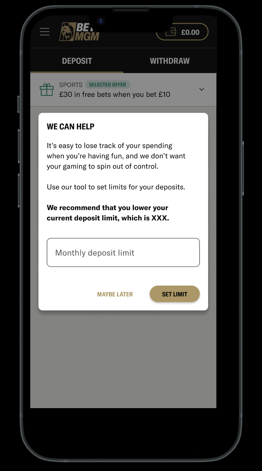
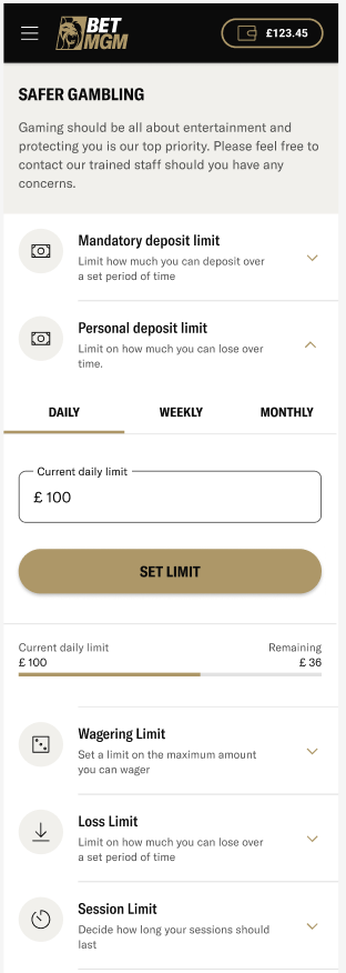
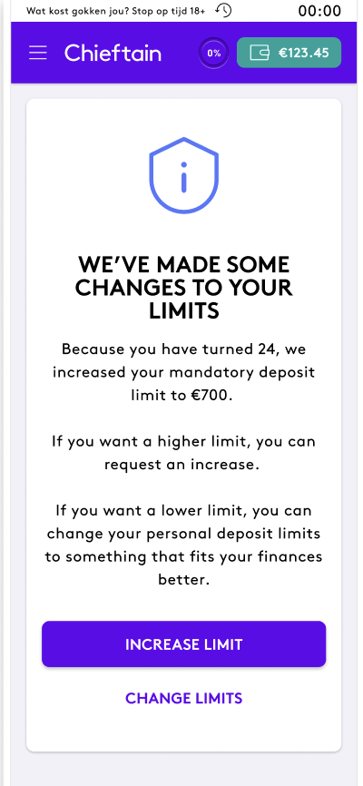
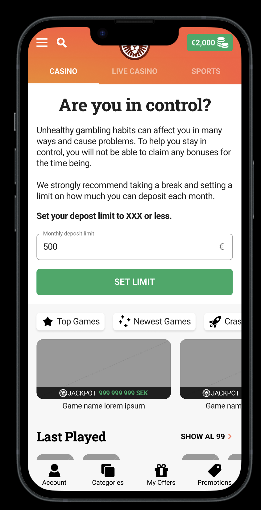
Keeping customers safe is critical in i-gaming. We monitor gambling habits and, at certain risk levels, show messages or reach out – encouraging players to set time and spending limits.
I was involved in a project to improve our responsible-gambling messages in Sweden together with researchers from Karolinska Institutet – an A/B test that brings their knowledge on gambling addiction into our copy. Writing these messages is always a fine line: friendly and straightforward, while staying within regulation.
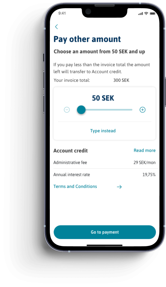
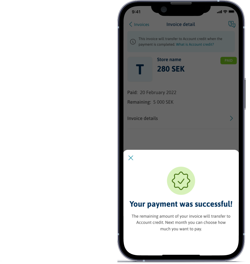
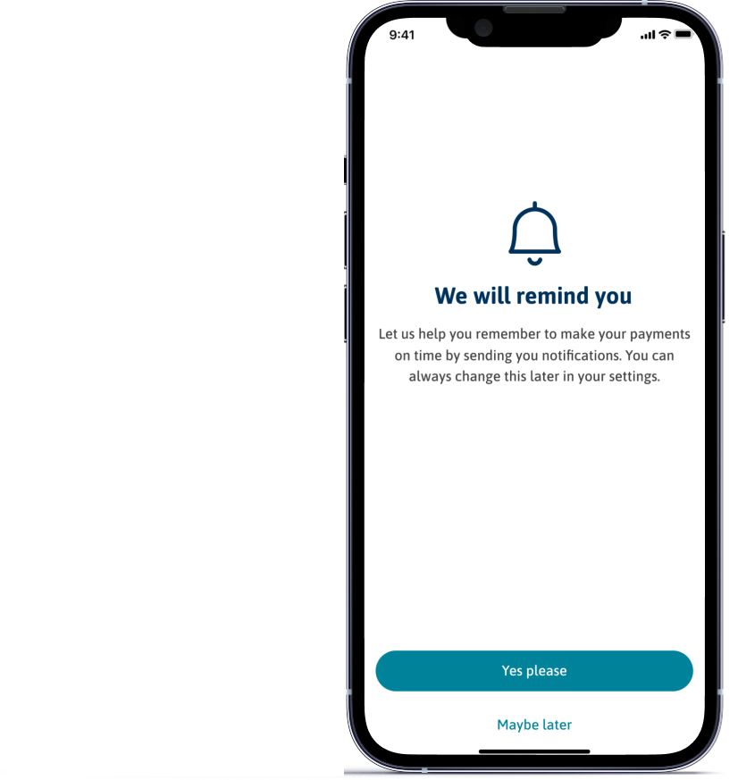
Small messages and pop-ups
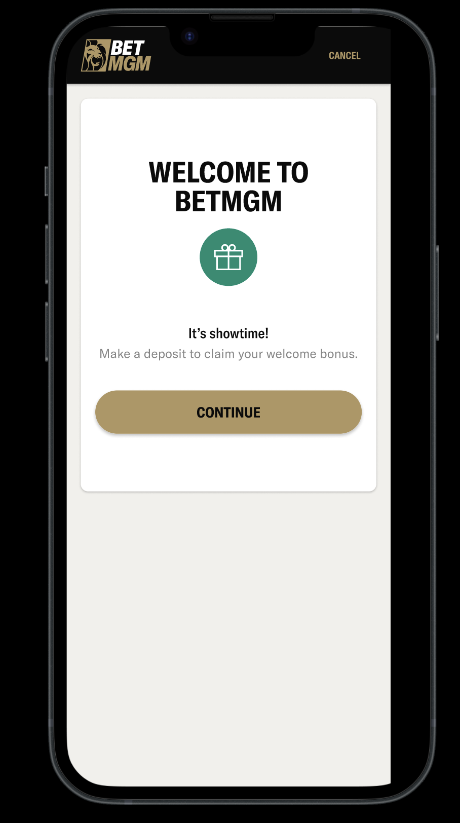
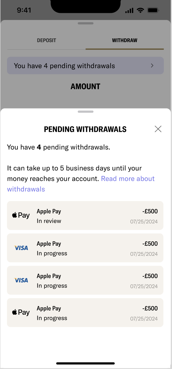
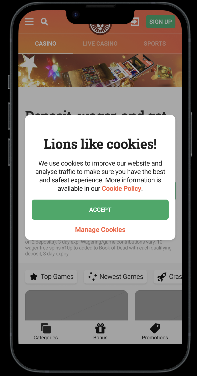
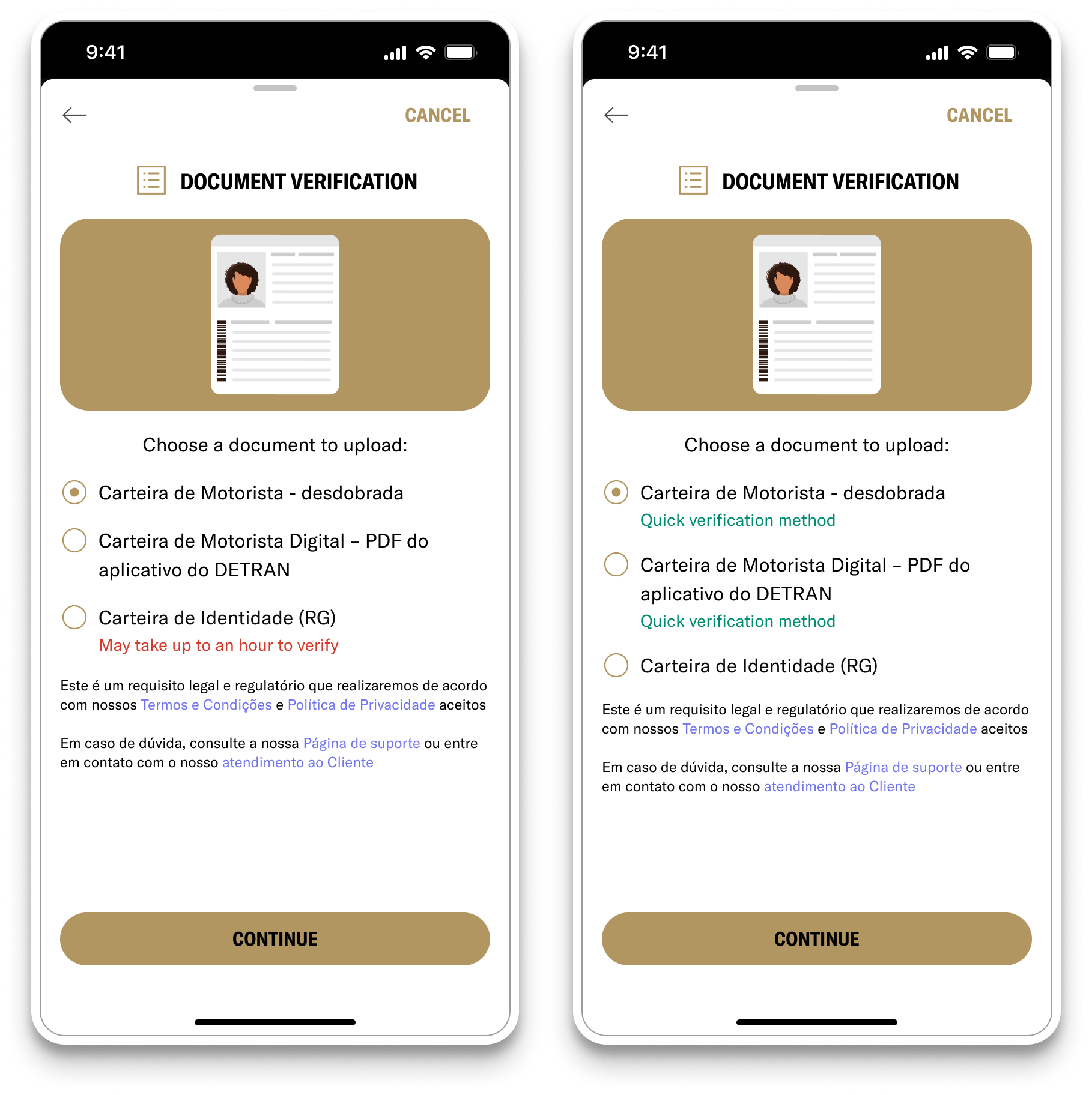
I try to keep messages short, clear and human – no overwhelming users with information they don't need. Welcome messages, cookie consent, error messages, withdrawal confirmations.